Comics covers have three jobs to do.
- A comic cover must speak to the tone and themes of the work inside.
- It must stand out on the shelves or webpage.
- It must be a beautiful object that you would like to have in your home.
There have been many arguments over the years about what a cover should be, but these are my rules.
I always prefer the cover to be done by the interior artist, but, if, for whatever reason, that’s not possible, then the cover should embody the tone of the book and its general themes. It does not have to be about precisely whatever is happening in the book itself. It represents the feel and atmosphere of the work.
My pitch for the PLANETARY covers was, every issue, the book would look nothing like anything else on the stands. Think about how comics are displayed in comics stores etc, sure, but think first about the impact of the image and design and what it does to you as a viewer and participant. The cover has to make you want to pick the book up and find out about it.
The third rule is the hardest, as everyone has different tastes. But when you have it, ask yourself: is this a thing I would want in my own home? On a table, or on a wall? Is it a beautiful object that would make my home a slightly lovelier place if I owned it? If your answer is, “well, it just does the job it’s supposed to do,” then it’s the wrong cover.
Now, here’s a completely counter intuitive example:
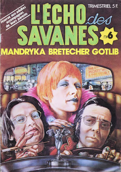
L’ECHO DES SAVANES was a French comics anthology magazine. This issue is from 1974. Those are the three editors and founders on the cover, the cartoonists Nikita Mandryka, Claire Bretecher and Marcel Gotlib. First, let us admire the flex: the editors had themselves painted for the cover of their own comic.
The tone of the thing? These three want to take you on a midnight ride through the dirty city. Gotlib looks a bit sleazy, Mandryka is a sinister intellectual and can we all just agree that Claire Bretecher looks incredibly fucking cool? You know what’s being promised.
Even in an age of fantastical comics covers in France, I bet you no other editorial team were getting themselves painted for a cover as creatures of the night who were ready to take you places you may not be ready to be taken to.
As an object, it is of its time, and there’s a little bit of big-head caricature to it. But it’s a lovely bit of painting, and the whole thing just makes me smile. It bypasses all the rules we have for comics covers and rides off into the dark.
Next time you’re near a comics or book store, have a look at the shelves, see what jumps out at you, and ask yourself why. It’s a useful question. And you’ll learn more about your own tastes as well as what design does to you.
(Previously published on my newsletter 5 January 2025. Click here to subscribe for free.)
Discover more from WARREN ELLIS LTD
Subscribe to get the latest posts sent to your email.