Graphic novellas were my favourite thing to write. I only did three original graphic novellas. Amazingly, they all seem to still be in print! Which is what I had hoped for them: the 48-page squarebound format should be a permanent edition.
I love that Ed Brubaker and Sean Phillips did MY HEROES HAVE ALWAYS BEEN JUNKIES as a 72-page edition. Hell, the very first TRANSMETROPOLITAN collection was 72 pages.
Sometimes, we should think in miniatures. A story should only be as long as it needs to be. By which I mean, the story should only be as long as the author thinks it needs to be. Other people will tell you that stories need to be longer. Don’t listen to them. Listen to the story.
The form is as close as we get to the European comics “album” – by which I mean a short standardised form. We can do the Euro size, but in the past people would immediately bitch about racking and shelving.
There are things we lost because they were not put into permanent editions, but were instead stapled and sold as standard periodical ephemera.
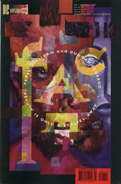
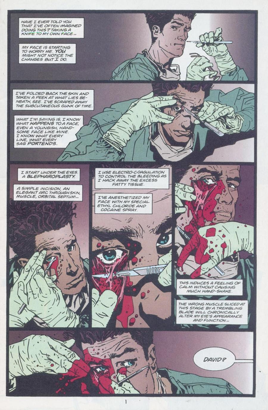
FACE, part of the “Vertigo Voices” sub-imprint, was bunged out saddle-stitched, and was gone a month later. Illustrated by Duncan Fegredo (who is one of the all-time British greats) and written by Peter Milligan in full command of his powers. This book was probably Vertigo’s literary-fiction peak. Bookstores could have displayed this next to Don DeLillo and Chuck Palahniuk.
Meanwhile, in Europe:
Manu Larcenet’s fucking diary comic from 2001, THE ARTIST IN THE FAMILY, is still in print. And I don’t mean to dis Manu at all — we hung out for a long weekend in Finland, many years ago, and generally had a great time being terrible to each other and worrying the shit out of our hosts. I really liked him. The book is great. But, you know, there are reasons why I’ve always looked to Europe as a publishing model.
Okay, hold on, I’m going random now:
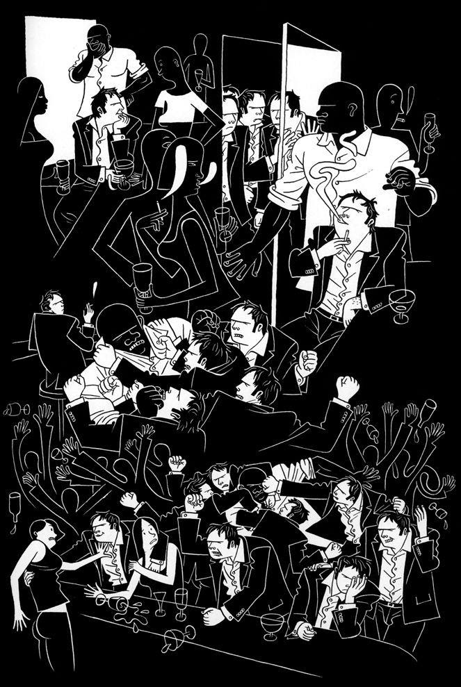
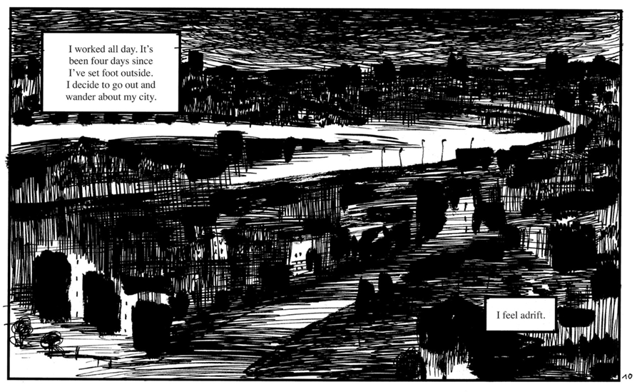
A few years later, in Oslo, I met Killoffer, then the recent creator of 676 APPARITIONS OF KILLOFFER, and just look at that fucking page.
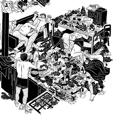
It is an absolutely monstrous book, and if you’d met Killoffer, sweetly teaching Norwegians just enough French to say “Killoffer is very beautiful,” you couldn’t quite imagine this awful, disturbing thing emanating from that warm, friendly man. But his control of the storytelling flow and the page is phenomenal.
And for no reason I’ve just been reminded of one of my favourite French comics magazine covers:
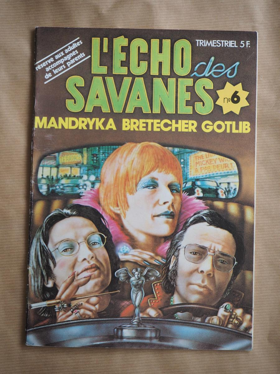
These are the three founders of the magazine. On the cover of their own magazine. 1974. I just love that in 1974 there was a comic whose cover was just a painting of the three founders looking this fucking cool (especially Claire Bretecher).
All of which is probably because in the back of my head I wanted to mention that IDW have been releasing new editions of Hugo Pratt’s CORTO MALTESE books:
And, while they can be deeply peculiar and very much of their time, like Herge, they still retain marvellous instruction in the use of the medium. Pratt, working on the larger Euro page, locks himself into a 12-panel grid for the most part. Here’s the thing about a consistent use of a grid, that’s been kind of forgotten over the years. You use it when you want the panelling to become invisible.
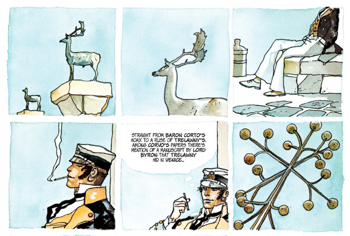
It is, in fact, the equivalent of using “said” in prose. We use “said” because we want the instruction to become invisible, for you to live inside the speech. To replace “said” with “bellowed” or “farted” or “wept” tilts the sentence towards the author. Regular unbroken consistent grid panelling stops you looking at the structure and has you simply focus on the words and pictures.
And old Killoffer up there takes the panel borders away entirely and has you slip and slide through the page. Two different ways of achieving the same thing.
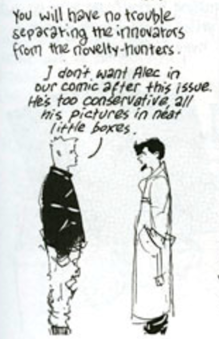
Which I think Eddie Campbell understood from the start:
(I wrote this ramble on my newsletter in 2018 and wanted to preserve it here as I revisit my thinking.)
Discover more from WARREN ELLIS LTD
Subscribe to get the latest posts sent to your email.