Xiao Jiang. I don’t know if there is actually any rain outside that window, but the whole image reminds me of melancholy, disappointed rainy days from childhood.
Imagine a Slushee composed of ammonia and water encased in a hard shell of water ice. Now picture these ice-encrusted slushballs, dubbed “mushballs,” raining down like hailstones during a thunderstorm, illuminated by intense flashes of lightning.
Planetary scientists at the University of California, Berkeley, now say that hailstorms of mushballs accompanied by fierce lightning actually exist on Jupiter. In fact, mushball hailstorms may occur on all gaseous planets in the galaxy, including our solar system’s other giant planets, Saturn, Uranus and Neptune.
morning computer: some useful things first thing in the day.
A comic cover must speak to the tone and themes of the work inside.
It must stand out on the shelves or webpage.
It must be a beautiful object that you would like to have in your home.
There have been many arguments over the years about what a cover should be, but these are my rules.
I always prefer the cover to be done by the interior artist, but, if, for whatever reason, that’s not possible, then the cover should embody the tone of the book and its general themes. It does not have to be about precisely whatever is happening in the book itself. It represents the feel and atmosphere of the work.
My pitch for the PLANETARY covers was, every issue, the book would look nothing like anything else on the stands. Think about how comics are displayed in comics stores etc, sure, but think first about the impact of the image and design and what it does to you as a viewer and participant. The cover has to make you want to pick the book up and find out about it.
The third rule is the hardest, as everyone has different tastes. But when you have it, ask yourself: is this a thing I would want in my own home? On a table, or on a wall? Is it a beautiful object that would make my home a slightly lovelier place if I owned it? If your answer is, “well, it just does the job it’s supposed to do,” then it’s the wrong cover.
Now, here’s a completely counter intuitive example:
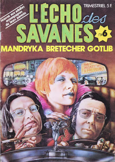
L’ECHO DES SAVANES was a French comics anthology magazine. This issue is from 1974. Those are the three editors and founders on the cover, the cartoonists Nikita Mandryka, Claire Bretecher and Marcel Gotlib. First, let us admire the flex: the editors had themselves painted for the cover of their own comic.
The tone of the thing? These three want to take you on a midnight ride through the dirty city. Gotlib looks a bit sleazy, Mandryka is a sinister intellectual and can we all just agree that Claire Bretecher looks incredibly fucking cool? You know what’s being promised.
Even in an age of fantastical comics covers in France, I bet you no other editorial team were getting themselves painted for a cover as creatures of the night who were ready to take you places you may not be ready to be taken to.
As an object, it is of its time, and there’s a little bit of big-head caricature to it. But it’s a lovely bit of painting, and the whole thing just makes me smile. It bypasses all the rules we have for comics covers and rides off into the dark.
Next time you’re near a comics or book store, have a look at the shelves, see what jumps out at you, and ask yourself why. It’s a useful question. And you’ll learn more about your own tastes as well as what design does to you.
“Milton Glaser: POP by Mirko Ilic, Beth Kleber and me showcases more than 1,000 pieces from the mid-1950s through the mid-’70s, including hundreds of book covers and jackets, many forgotten for decades. Rather than closing the book on Glaser’s “pop” era, our book opened the doors to further lost artifacts, now found. Ilic has continued to uncover the covers of more than a dozen books that were completely unknown to us as editors, and probably forgotten by Glaser himself.”
French architect and artist Emmanuelle Moureaux unveiled a vibrant, seemingly infinite room in Tokyo to celebrate the 75th anniversary of Bulgari’s iconic coiled jewelry designs. The 50th work in the artist’s 100 colors series (previously), “SERPENTI” reflects timelessness and eternity through elaborate repetition and eternity through elaborate repetition, gradient hues, and a mirrors that transform a single corridor into a never-ending view.
Reflecting the brand’s roots in Rome, Moureaux installed more than 347,000 Roman numerals from 1 to 100—or I to C—onto 100 large, transparent panels, which are cut out in the middle so visitors can walk inside. The numerals are meticulously laid out on a grid to create an endless effect, increasing and changing color the further one ventures into the artwork.
Eric C. Wilder is a freelance cover designer. He, along with designer Cherie Chapman, is co-founder of Chapman & Wilder, a studio specializing in book covers, interior layout, and marketing across all genres. Here he takes us through his process for designing the cover for Everything That Hurt Us Becomes a Ghost.
Science meets psychedelic color in the 2022 Evident Image of the Year awards. From the vibrant, feather-like crystals of a topical medicine to the shimmering scales of a Urania ripheus moth, the winning works unveil a slew of vibrant, microscopic wonders found around the world. This year’s top image comes from molecular biologist Laurent Formery, who documented the spindly, spiky nervous system of a young sea star. Reaching approximately one centimeter wide, the minuscule specimen glows with kaleidoscopic hues under a color-coded Z-projection.
This is fascinating. The book Forgotten Heritage: Uncovering Singapore’s Traditional Chinese Puppets comes in a fabric case that you have to cut and unfold to begin the book. There’s a video at this link.
This is the sort of thing that keeps physical publishing a living and growing thing: you can’t download that tactile, revelatory experience. That would be an object to delight in owning and reading. I bet you some people buy two – one to cut and one to keep intact, as they both have their joys.
This is a book cover. I discovered it on a Book Cover Review post, and hunted for a better image than they had. The post by Erik Carter includes interior images and more details.
While the cover is an absolute failure of marketing, it’s an absolute triumph of aesthetics and form. Edelmann is most known for being the art director on Yellow Submarine (the ground-breaking psychedelic Beatles animated film), but he had a long career as an illustrator, cover designer and educator working on everything from a German edition of The Lord of the Rings to illustrations for the youth magazine twen. The cover Edelmann designed for Mitkey Astromouse is a block of text typed in Othello describing the story, shouting out the authors, and rendering the title illegible with a colourful rainbow scribble. It’s hard to imagine such a design existing in 2023, or even in the 1970s, and it’s no wonder that the book became an obscure curio instead of a top-selling smash.
It’s kind of fascinating. I’ve been thinking for a while about text on covers – there were a couple of interesting examples in 2022 — and here’s one that’s right out on the edge.