
New York City gets a new subway map for the first time since 1972. And it is far more like the London Underground map.
The 1972 iteration, for comparison:

I like maps.
Comments closeda writer's notebook
New York City gets a new subway map for the first time since 1972. And it is far more like the London Underground map.
The 1972 iteration, for comparison:
I like maps.
Comments closed
Of the Oscar nominees for Best Picture, I have only seen DUNE PART TWO and THE BRUTALIST all the way through. ANORA and THE SUBSTANCE have been in my queue for ages, and I do want to see CONCLAVE because I enjoyed the book. DUNE PART TWO is fine, occasionally brilliant, and a clever adaptation/update of the original text. Its flaws are minor – Javier Barden spends the last half of the film saying nothing but “Lisan al-Gaib” in varying tones, and establishing the family atomics and then having Timothee Chalamet looking directly at them exploding seems like a slip. But it’s fine.
THE BRUTALIST, working with a total budget that might just have covered the cost of DUNE PART TWO’s costumes, is something else. It, too, has flaws. We see what we presume to be Adrien Brody’s left hand writing a letter, but Brody is right-handed for the rest of the film. Scenes are over-long. It loses sense of its own timeline here and there. But it is a work of great ambition. Yes, so is DUNE, but DUNE is starting from an established text. THE BRUTALIST starts from scratch, inspired by true stories but not bound by them. It goes for something else, something bigger.
(The score, by the way, is brilliant, and goes a long way towards arranging the scale of the film. When it comes in, it’s immense. That Oscar was deserved.)
It’s the story of Bauhaus-trained monumental architect Laszlo Toth escaping to America after the Holocaust and falling into the orbit of a shallow, rapacious industrialist who commissions Toth to build a community center to honour his dead mother. Everything goes wrong. But Toth sees the shape of the place. He sees its statement. Almost all in his life is sacrificed to making it real.
It’s art as a balance between cost and reward. What the world wants and what the mind wants.
It’s a tricky film. Sometimes it wants you to take it literally, sometimes it wants you to see through it and its people. Its Brutalist architecture is a put-on, because the Brutalist of the title isn’t the architect or the architecture. Full marks for using Bauhaus design for the main titles, though. It’s a long film, and, like the center Toth builds, it’s far vaster in its underneath than it looks.
The coda is odd. It radically complicates and re-contextualises most of the previous two hours. It’s about the power of art to take ownership of victimhood and transcend it: the power of a creative mind to pull a victory from the mud.
Brady Corbet and Mona Fastvold pull off a huge magic trick in THE BRUTALIST, and it’s worthy of awards. I am faintly annoyed it didn’t get Best Picture, because that would have been a strong signal about art. I’m looking forward to watching it several more times.
“No matter what the others try and sell you, it is the destination, not the journey.”
(Written for my newsletter, 9 March 2025)
CONNECTED:
2 Comments
Phillippe Starck designs a nine-floor hotel with a 19th Century mansion stuck on top. There’s your boom boom vibe shift right there.


HOO Cafe Kyoto. I love that little sign.
All of these things give me pleasure because they are uncommon and ambitious.

morning computer: some useful things first thing in the day.
My free weekly newsletter is at https://orbitaloperations.beehiiv.com/
One Comment
Mandy Barker’s cyanotypes of junk found in water.

Brutalist-style hilltop home intended to look like an ancient ruin.
(Which really just summons Albert Speer and “ruin value” to my mind, oops)

A team of Egyptian-American archaeologists has uncovered the tomb of an unknown king who reigned over the region of Abydos in southern Egypt 3,600 years ago.
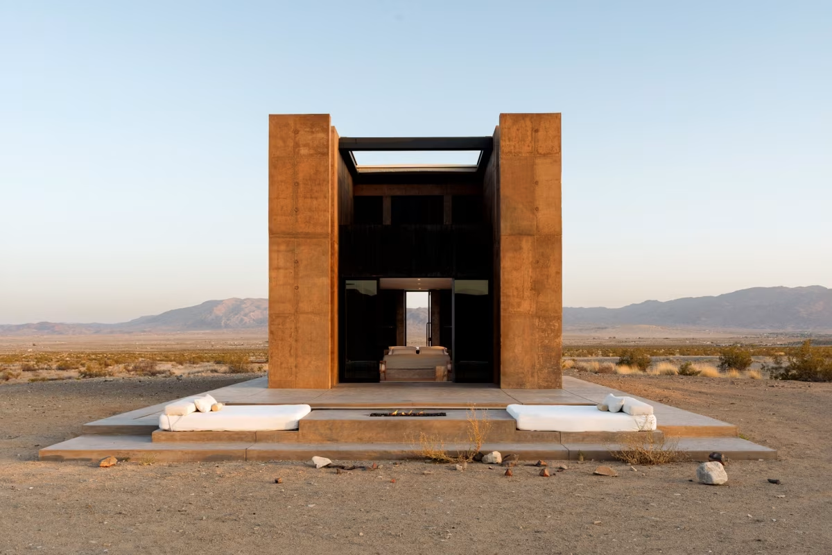
Luxury real estate goes off-grid. Ruins in waiting.
I used to ride the train past the Olympic stadium in Stratford quite often, and would frequently imagine it repurposed as a post-apocalyptic ritual space, a giant radio dish for praying to the space gods and a complicated gallows for mass executions.

morning computer: some useful things first thing in the day.
My free weekly newsletter is at https://orbitaloperations.beehiiv.com/
Comments closed
Love this cover found via Sougwen Chung. I think I also want to read that book.
I found these via The Casual Optimist:

The guts to put a chapter “track listing” underneath the square album-cover image!


Again, a little courage in design – the crossing-out.
Comments closedComics covers have three jobs to do.
There have been many arguments over the years about what a cover should be, but these are my rules.
I always prefer the cover to be done by the interior artist, but, if, for whatever reason, that’s not possible, then the cover should embody the tone of the book and its general themes. It does not have to be about precisely whatever is happening in the book itself. It represents the feel and atmosphere of the work.
My pitch for the PLANETARY covers was, every issue, the book would look nothing like anything else on the stands. Think about how comics are displayed in comics stores etc, sure, but think first about the impact of the image and design and what it does to you as a viewer and participant. The cover has to make you want to pick the book up and find out about it.
The third rule is the hardest, as everyone has different tastes. But when you have it, ask yourself: is this a thing I would want in my own home? On a table, or on a wall? Is it a beautiful object that would make my home a slightly lovelier place if I owned it? If your answer is, “well, it just does the job it’s supposed to do,” then it’s the wrong cover.
Now, here’s a completely counter intuitive example:
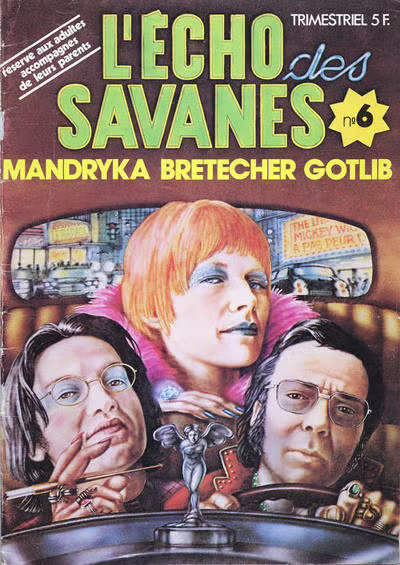
L’ECHO DES SAVANES was a French comics anthology magazine. This issue is from 1974. Those are the three editors and founders on the cover, the cartoonists Nikita Mandryka, Claire Bretecher and Marcel Gotlib. First, let us admire the flex: the editors had themselves painted for the cover of their own comic.
The tone of the thing? These three want to take you on a midnight ride through the dirty city. Gotlib looks a bit sleazy, Mandryka is a sinister intellectual and can we all just agree that Claire Bretecher looks incredibly fucking cool? You know what’s being promised.
Even in an age of fantastical comics covers in France, I bet you no other editorial team were getting themselves painted for a cover as creatures of the night who were ready to take you places you may not be ready to be taken to.
As an object, it is of its time, and there’s a little bit of big-head caricature to it. But it’s a lovely bit of painting, and the whole thing just makes me smile. It bypasses all the rules we have for comics covers and rides off into the dark.
Next time you’re near a comics or book store, have a look at the shelves, see what jumps out at you, and ask yourself why. It’s a useful question. And you’ll learn more about your own tastes as well as what design does to you.
(Previously published on my newsletter 5 January 2025. Click here to subscribe for free.)
Comments closed
From the website FUTURE FORMS, “a collection of designer, space-age and minimalist electronics.”

This is a terrible rabbit hole for me to go down.


I like this poster for the film TOTEM by Lilia Aviles.
…found something wonderful at Brockley Station.
Placed along the platform were “InfoTotems” (at least that’s what they were called on the back of them). Sturdy, about 1.5m high and with – crucially in the bright SE London sunlight of August – easily-readable low-power E-Ink screens.
INFOTOTEMS. Quite fond of that. Worth stealing.
(Also note the first ever appearance in the English language of the phrase “found something wonderful at Brockley”)
Comments closed
I like a good mountain. There’s a couple sitting in the back of this magnificent film poster by Brian Hung.

We don’t really have mountains where I live. I walked up part of the Wrekin when I was a little kid, but people in other parts of the world would call that a hill. I remember being in Oregon and seeing Mount Hood way in the distance painted bronze by the late afternoon light and just staring at it.
And in (this piece by Zhu Da, by contrast, the trees and rocks and mountains are brushstrokes and gestures. His vision is calligraphic.

“Four monks posted at the edge of the terrace of the monastery courtyard scan the far reaches of the valley. As soon as they glimpse the guest of honour they sound their enormous dun-chen horns, whose deep bass tones reverberate in the steep, white heights of the mountain. The silent snow captures and amplifies this extension of the human voice as it rings out to welcome the guest. Simultaneously a fire of sweet-smelling herbs is lit. Soon afterwards the rgya-glin oboes are heard. The lama climbs slowly upwards and the music does not cease until he has crossed the threshold of the monastery.”
OCEAN OF SOUND, David Toop
CONNECTED:
